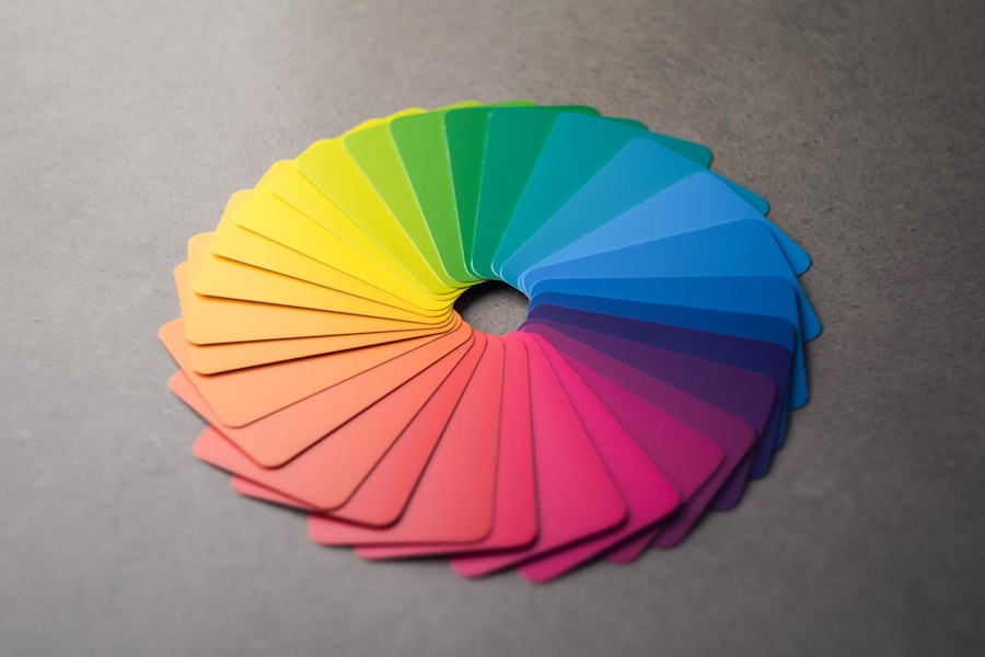
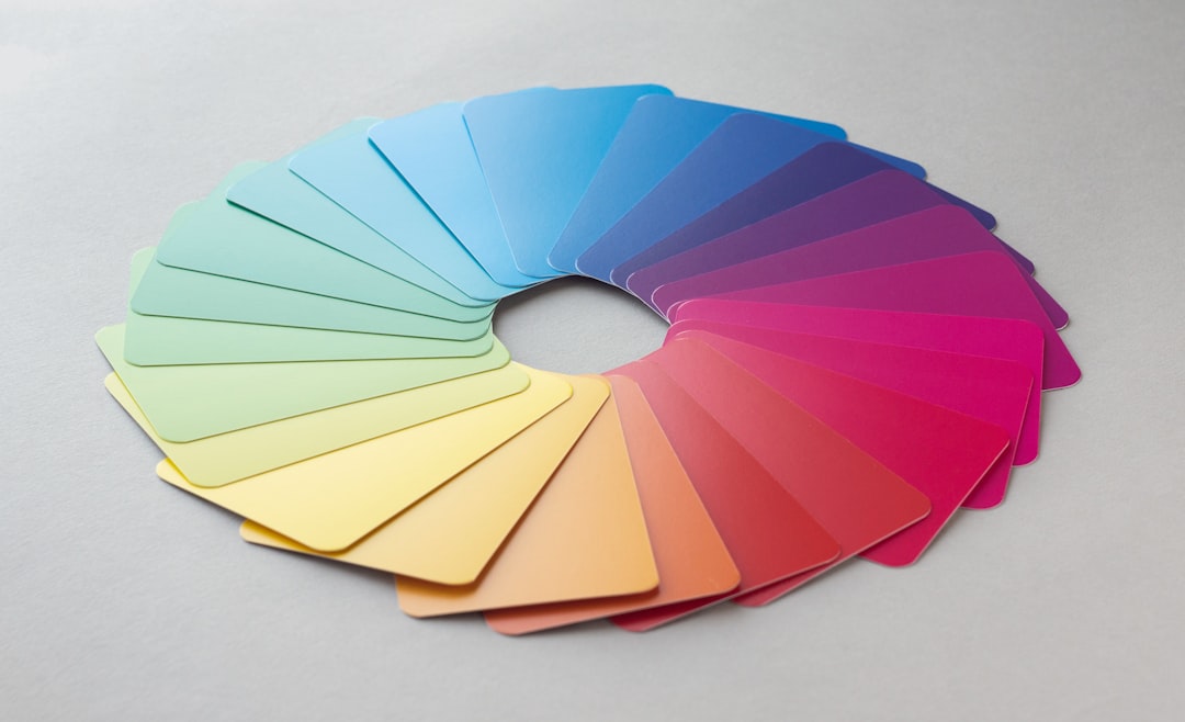
The color wheel is a fundamental tool in the study of color theory, serving as a visual representation of the relationships between colors. Developed by Isaac Newton in the 17th century, the color wheel organizes colors in a circular format, allowing for a clear understanding of how colors interact with one another. At its core, the wheel is divided into primary, secondary, and tertiary colors, each playing a crucial role in the creation of various hues.
The primary colors—red, blue, and yellow—are the building blocks of all other colors. By mixing these primary colors in different combinations, artists and designers can create a vast array of shades and tones, making the color wheel an essential reference for anyone working with color. In addition to its practical applications in art and design, the color wheel also provides insight into the emotional and psychological effects of color.
Each color on the wheel can evoke different feelings and associations, influencing how we perceive our environment. For instance, colors that are adjacent to one another on the wheel are known as analogous colors and tend to create harmonious combinations. Conversely, complementary colors—those that are opposite each other on the wheel—can create striking contrasts that draw attention.
Understanding these relationships is vital for anyone looking to use color effectively, whether in painting, interior design, or branding.
Key Takeaways
- The color wheel is a visual representation of how colors relate to each other and can be used to create harmonious color schemes.
- Primary colors, such as blue and yellow, play a crucial role in creating green through color mixing.
- Secondary colors, like orange and purple, can influence the shade of green when mixed with primary colors.
- Tertiary colors, which are created by mixing primary and secondary colors, contribute to the various tones and shades of green.
- Understanding the science of color mixing is essential for creating different shades and tones of green.
Primary Colors and Their Role in Creating Green
The Role of Primary Colors in Creating Green
When it comes to creating green, blue and yellow are the primary colors that come into play. By blending these two colors in equal parts, one can achieve a vibrant green hue. This process highlights the importance of primary colors in color mixing and demonstrates how they serve as the essential building blocks for more complex shades.
Influencing the Perception of Green
The role of primary colors extends beyond mere mixing; they also influence the perception of green itself. For instance, varying the proportions of blue and yellow can lead to a wide range of greens—from a bright lime green to a deep forest green. This versatility allows artists and designers to manipulate green’s appearance based on their desired outcome.
Primary Colors in Color Selection
Additionally, understanding how primary colors interact with one another can help individuals make informed choices when selecting palettes for various projects. Whether one is painting a landscape or designing a logo, recognizing the foundational role of primary colors is crucial for achieving the intended visual impact.
Secondary Colors and Their Influence on Green

Secondary colors emerge from the mixing of two primary colors, creating a new layer of complexity within the color wheel. The three secondary colors—green, orange, and purple—are formed by combining equal parts of two primary colors. In the case of green, it is created by mixing blue and yellow.
This relationship underscores how secondary colors not only expand the palette available to artists but also enhance our understanding of color dynamics. Green, as a secondary color, embodies a unique blend of warmth from yellow and coolness from blue, resulting in a hue that is often associated with nature and tranquility. The influence of secondary colors on green extends beyond mere creation; it also affects how green is perceived in various contexts.
For example, when green is paired with its complementary color red, it can create a striking visual contrast that draws attention. This interplay between secondary and primary colors allows for greater creativity in design and art. Additionally, secondary colors can evoke different emotions when used alongside green; for instance, combining green with orange may evoke feelings of vitality and energy, while pairing it with purple might create a sense of calmness and introspection.
Understanding these relationships can empower artists and designers to craft more nuanced compositions.
Tertiary Colors and How They Contribute to Green
| Tertiary Color | Primary Colors Used | Contribution to Green |
|---|---|---|
| Yellow-Green | Yellow + Green | Enhances the brightness and vibrancy of green |
| Blue-Green | Blue + Green | Creates a cooler and more calming shade of green |
| Yellow-Orange | Yellow + Orange | Brings warmth and energy to green |
| Red-Orange | Red + Orange | Adds depth and richness to green |
| Blue-Violet | Blue + Violet | Creates a more subdued and sophisticated green |
| Red-Violet | Red + Violet | Provides a sense of drama and contrast to green |
Tertiary colors are formed by mixing a primary color with a secondary color, resulting in a more complex spectrum of hues. In the context of green, several tertiary shades can be created by blending green with either yellow or blue. For instance, mixing yellow-green or blue-green introduces new dimensions to the color palette, allowing for an exploration of various shades that can evoke different feelings and atmospheres.
These tertiary variations are essential for artists seeking to capture specific moods or themes in their work. The subtle differences between these shades can significantly impact the overall composition and emotional resonance of a piece. Moreover, tertiary colors contribute to the richness and depth of green in both art and design.
By incorporating shades like olive green or teal into their work, artists can create more intricate visual narratives that resonate with viewers on multiple levels. The ability to manipulate these tertiary hues allows for greater flexibility in achieving desired effects—whether it’s creating a serene landscape or an energetic abstract piece. Understanding how tertiary colors interact with both primary and secondary hues is vital for anyone looking to master color mixing and develop a sophisticated approach to their artistic endeavors.
The Science of Color Mixing
The science behind color mixing is rooted in both physics and perception. When light interacts with objects, it reflects certain wavelengths while absorbing others; this interaction determines the color we perceive. In additive color mixing—used in digital screens—colors are created by combining light sources (red, green, and blue).
When these lights overlap, they produce new colors based on their combinations; for example, red light mixed with green light creates yellow light. This principle is crucial for understanding how digital media operates and how artists can manipulate light to achieve desired effects. Conversely, subtractive color mixing occurs when pigments or dyes are combined.
This method is commonly used in painting and printing processes where colors absorb certain wavelengths while reflecting others. In this context, mixing pigments like cyan, magenta, and yellow results in various hues through absorption rather than light emission. Understanding these two distinct methods of color mixing is essential for artists and designers alike; it allows them to choose appropriate techniques based on their medium while also providing insight into how different materials interact with light to produce color.
The Psychology of Green

Green is often associated with nature, growth, and renewal—a connection that has deep psychological implications. Studies have shown that exposure to green environments can have calming effects on individuals, reducing stress levels and promoting feelings of tranquility. This association stems from our evolutionary history; as humans evolved in natural settings filled with greenery, our brains developed positive responses to these environments.
Consequently, green is frequently used in design and branding to evoke feelings of freshness and vitality. Businesses aiming to promote health or sustainability often incorporate green into their logos or marketing materials to align themselves with these positive associations. Furthermore, different shades of green can elicit varying emotional responses.
For instance, lighter greens may evoke feelings of youthfulness and energy, while darker greens can convey stability and reliability. This versatility makes green an effective tool for communication in both art and marketing contexts. By understanding the psychological implications of different shades of green, artists and designers can strategically select hues that resonate with their intended audience or message.
Whether aiming to inspire calmness or convey growth, harnessing the psychological power of green can significantly enhance the effectiveness of visual communication.
Cultural and Symbolic Meanings of Green
Across cultures worldwide, green holds diverse symbolic meanings that reflect its connection to nature and life. In many societies, green represents fertility and abundance due to its association with lush landscapes and agricultural growth. For example, in ancient Egypt, green was linked to regeneration and rebirth; it was often used in art depicting life after death.
Similarly, in various Asian cultures, green symbolizes harmony and balance—a reflection of its prevalence in natural settings that promote well-being. These cultural associations highlight how deeply ingrained our perceptions of color are within societal contexts. Moreover, green’s symbolism extends into modern contexts as well; it has become synonymous with environmentalism and sustainability movements globally.
As concerns about climate change grow more pressing, green has emerged as a powerful symbol for ecological awareness and responsibility. Organizations advocating for environmental protection often utilize this color in their branding to communicate their commitment to preserving nature’s beauty. Understanding these cultural nuances allows artists and designers to navigate complex meanings associated with green while creating works that resonate across different audiences.
Exploring Different Shades and Tones of Green
The world of green encompasses an extensive range of shades and tones that can evoke various emotions and atmospheres. From vibrant lime greens that exude energy to muted sage greens that promote calmness, each shade carries its unique character. Artists often experiment with these variations to achieve specific effects within their work; for instance, using bright greens may convey a sense of playfulness or vitality in a piece aimed at children’s themes while opting for deeper forest greens might evoke feelings of serenity or introspection in more contemplative works.
Additionally, understanding how different shades interact with other colors can enhance an artist’s palette significantly. Pairing bright greens with warm oranges can create dynamic contrasts that energize a composition while combining softer greens with cool blues may produce harmonious blends that soothe the viewer’s eye. This exploration into shades not only enriches artistic expression but also allows designers to craft visually compelling narratives through strategic color choices—ultimately leading to more impactful communication across various mediums.
In conclusion, the study of green within the broader context of color theory reveals its multifaceted nature—from its foundational role as a secondary color derived from primary hues to its psychological implications and cultural significance across societies worldwide. By delving into the science behind color mixing alongside exploring diverse shades and tones associated with green, artists and designers alike can harness this powerful hue effectively within their work—creating pieces that resonate deeply with audiences while conveying rich narratives through visual language.
If you’re curious about which colors make green and how they can be used in artistic expression, you might find it interesting to explore how emotions are conveyed through art. A related article, “Unveiling Emotions on Canvas or Paper: The Power of Artistic Expression,” discusses the impact of different emotions in artwork and how artists bring these feelings to life. This can be particularly insightful when considering how the color green, often associated with feelings of calmness and renewal, is used to evoke specific emotions in art. You can read more about this topic by visiting Unveiling Emotions on Canvas or Paper: The Power of Artistic Expression.
FAQs
What are the primary colors that make green?
The primary colors that make green are blue and yellow. When these two colors are mixed together, they create the color green.
How do blue and yellow make green?
Blue and yellow make green through a process called subtractive color mixing. When blue and yellow pigments are mixed together, they absorb certain wavelengths of light and reflect others, resulting in the perception of the color green.
Can other colors be mixed to make green?
While blue and yellow are the primary colors that make green, other combinations of colors can also be used to create different shades of green. For example, adding a small amount of black to a mixture of blue and yellow can create a darker shade of green.
What happens when you mix green with other colors?
When green is mixed with other colors, it can create a variety of different shades and tones. For example, mixing green with blue can create a teal color, while mixing green with yellow can create a brighter, more vibrant green.
