Color mixing is a fundamental concept in art and design, serving as the foundation for creating a vast array of hues and shades. At its core, color mixing can be divided into two primary categories: additive and subtractive mixing. Additive color mixing occurs when light colors are combined, such as in digital screens or stage lighting, where red, green, and blue (RGB) light combine to create various colors.
In contrast, subtractive color mixing involves the blending of pigments or dyes, which absorb certain wavelengths of light while reflecting others. This method is commonly used in painting and printing, where the primary colors—cyan, magenta, and yellow (CMY)—are mixed to produce a wide spectrum of colors. Understanding these two methods is essential for artists and designers alike, as it allows them to manipulate colors effectively to achieve their desired outcomes.
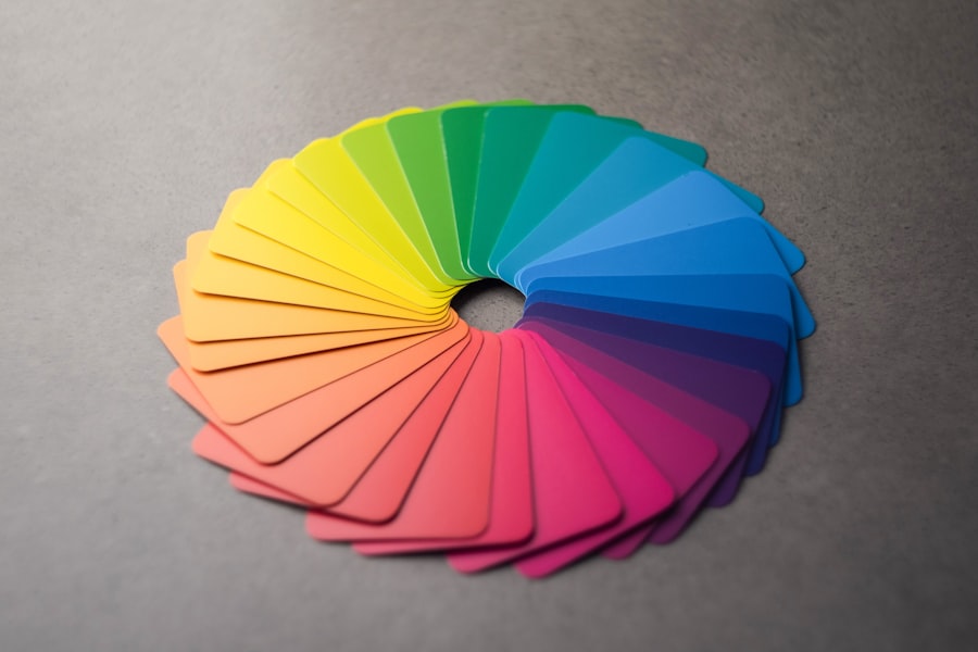
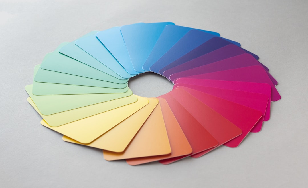
The interplay between colors is not merely a technical skill; it also involves an understanding of color theory, which encompasses the relationships between colors on the color wheel. Complementary colors, for instance, are those that are opposite each other on the wheel and can create striking contrasts when used together. Analogous colors, on the other hand, are adjacent to one another and tend to create harmonious compositions.
The nuances of color mixing extend beyond mere aesthetics; they also evoke emotional responses and can influence perceptions. For example, the way colors blend can alter their intensity and vibrancy, leading to different interpretations and feelings associated with a particular hue. Thus, mastering the basics of color mixing is not only about technical proficiency but also about harnessing the emotional power of color in visual communication.
Key Takeaways
- Color mixing involves combining different colors to create new shades and hues.
- Primary colors, such as red, blue, and yellow, play a crucial role in creating pink through various mixing techniques.
- Pink pigments are created through the use of minerals, organic compounds, and synthetic dyes, each with their own chemical properties.
- The perception of pink is influenced by light and how our eyes and brain interpret the color spectrum.
- Pink is often associated with femininity, love, and tenderness, and has different cultural and psychological meanings around the world.
The Role of Primary Colors in Creating Pink
Understanding Primary Colors
To comprehend the creation of pink, it’s essential to delve into the concept of primary colors. In traditional color theory, primary colors are those that cannot be created by mixing other colors together; they serve as the building blocks for all other hues. In the subtractive color model, the primary colors are red, yellow, and blue.
The Role of Red in Creating Pink
When it comes to creating pink, red plays a pivotal role as it is the primary color that directly contributes to this soft hue. By mixing red with white, one can achieve various shades of pink, ranging from pastel tones to more vibrant variations. The addition of white lightens the red pigment, resulting in a softer and more delicate color that is widely associated with tenderness and femininity.
Alternative Methods of Creating Pink
In the additive color model, however, pink can also be created by combining red light with green light. This method highlights the versatility of pink as a color that can be derived from different combinations depending on the medium being used. The significance of primary colors extends beyond their role in mixing; they also influence how we perceive pink in various contexts.
The Emotional Implications of Pink
For instance, the intensity of the red used in creating pink can dramatically affect its emotional resonance. A bright, vivid pink may evoke feelings of excitement and energy, while a muted pastel pink may convey calmness and serenity. Thus, understanding the role of primary colors in creating pink not only involves technical knowledge but also an appreciation for the emotional implications tied to different shades.
The Science Behind Pink Pigments

The creation of pink pigments is rooted in both chemistry and artistry. Pink pigments are typically derived from red pigments that have been modified or diluted to achieve the desired hue. One common method involves mixing red pigments with white pigments such as titanium dioxide or zinc oxide.
This process not only lightens the red but also alters its opacity and texture, resulting in a range of pink shades suitable for various applications in art and design. The science behind these pigments is fascinating; it involves understanding how different materials interact with light and how they can be manipulated to produce specific visual effects. Moreover, the stability and permanence of pink pigments are crucial considerations for artists and manufacturers alike.
Some pink pigments are more stable than others when exposed to light or environmental conditions. For instance, synthetic organic pigments like quinacridone rose offer excellent lightfastness and vibrant coloration, making them popular choices among artists. Conversely, certain natural pigments may fade over time or change hue when exposed to sunlight or moisture.
This variability underscores the importance of selecting appropriate materials based on their intended use. Ultimately, the science behind pink pigments combines artistic intuition with chemical knowledge, allowing creators to produce stunning works that stand the test of time.
The Influence of Light and Perception on Pink
| Aspect | Metrics |
|---|---|
| Light Intensity | Measured in lux |
| Perception of Pink | Subjective evaluation |
| Color Temperature | Measured in Kelvin |
| Emotional Response | Subjective evaluation |
Light plays a critical role in how we perceive color, including pink. The way light interacts with surfaces can dramatically alter our experience of a color. For instance, under natural daylight conditions, pink may appear more vibrant and lively compared to artificial lighting, which can sometimes wash out its intensity.
This phenomenon is due to the varying wavelengths of light emitted by different sources; natural sunlight contains a full spectrum of colors that enhances our perception of hues. Additionally, the angle at which light strikes a surface can create shadows and highlights that further influence how we see pink in a given context. Perception is also shaped by individual experiences and cultural backgrounds.
Different cultures may associate varying meanings with the color pink based on societal norms and historical contexts. For example, in Western cultures, pink is often linked to femininity and romance, while in some Eastern cultures, it may symbolize springtime or renewal. This subjective nature of color perception means that two individuals may experience the same shade of pink differently based on their personal associations and environmental factors.
Understanding these nuances is essential for artists and designers who wish to convey specific messages or emotions through their use of color.
Cultural and Psychological Associations with Pink
Pink has a rich tapestry of cultural and psychological associations that vary across different societies and historical periods. In many Western cultures, pink is often viewed as a symbol of femininity and softness. It has been widely adopted in marketing aimed at women and girls, reinforcing stereotypes about gender roles from an early age.
This association has led to a proliferation of pink products designed for women, from clothing to home decor items. However, this cultural perception is not universal; in some cultures, pink may represent different concepts altogether—such as love or friendship—demonstrating how deeply ingrained cultural narratives shape our understanding of color. Psychologically, pink has been shown to evoke specific emotional responses.
Research suggests that exposure to pink can have calming effects on individuals; this has led to its use in environments such as prisons or mental health facilities where a soothing atmosphere is desired. The phenomenon known as “Baker-Miller Pink,” named after a specific shade used in a correctional facility in the 1970s, was found to reduce aggressive behavior among inmates temporarily. Such findings highlight how color can influence mood and behavior on both individual and societal levels.
As our understanding of psychology continues to evolve, so too does our appreciation for how colors like pink can shape human experiences.
The Chemistry of Synthetic Pink Dyes

The development of synthetic pink dyes has revolutionized various industries, from textiles to cosmetics. These dyes are typically derived from organic compounds that undergo chemical processes to create vibrant hues that are both stable and long-lasting. One notable example is the dye known as “fuchsine,” which was first synthesized in 1859 by chemist Heinrich Caro.
Fuchsine is a bright magenta dye that quickly gained popularity due to its vivid coloration and versatility across different applications. The chemistry behind synthetic dyes involves complex reactions that allow for precise control over color saturation and stability. In addition to fuchsine, other synthetic dyes such as “Rhodamine B” have emerged as popular choices for creating shades of pink in various products.
These dyes are often favored for their ability to withstand fading when exposed to light or washing processes—qualities that are essential for maintaining product integrity over time. However, concerns about environmental impact have led to increased scrutiny regarding the production and disposal of synthetic dyes. As awareness grows about sustainability issues within the fashion industry and beyond, researchers are exploring alternative methods for dye production that minimize ecological harm while still delivering vibrant colors like pink.
Natural Sources of Pink Pigments
While synthetic dyes dominate many industries today, natural sources of pink pigments have been utilized for centuries across various cultures worldwide. Historically, artists relied on materials derived from plants, minerals, and insects to create their palettes. One well-known natural source is cochineal—a dye obtained from scale insects found primarily in Central and South America.
Cochineal produces a rich crimson pigment known as carmine that has been used for centuries in textiles and cosmetics alike. Its vibrant hue has made it a sought-after ingredient despite its labor-intensive harvesting process. Another natural source of pink pigment comes from certain plants such as madder root or beetroot.
Madder root contains alizarin—a compound that produces shades ranging from deep red to soft pink when processed correctly. Similarly, beetroot juice can yield a beautiful fuchsia hue when used as a dye for fabrics or food products. These natural pigments not only offer unique aesthetic qualities but also carry cultural significance tied to traditional practices within various communities around the globe.
As interest in sustainable practices grows within art and design fields alike, there is renewed appreciation for these time-honored methods of pigment production.
The Evolution of Pink in Art and Fashion
The evolution of pink as a color in art and fashion reflects broader societal changes throughout history. In earlier centuries, pink was often associated with nobility and wealth due to the difficulty of producing certain shades from natural sources like cochineal or madder root. During the Rococo period in 18th-century France, pastel colors—including soft pinks—became fashionable among aristocrats who sought to express their refined tastes through elaborate clothing designs adorned with delicate hues.
This trend marked an important shift toward embracing lighter shades that conveyed elegance and sophistication. In modern times, pink has undergone further transformations within both art movements and fashion trends. The rise of feminism in the late 20th century challenged traditional notions surrounding gendered colors; women began reclaiming pink as a symbol of empowerment rather than mere femininity.
Artists like Jeff Koons have incorporated bold shades of pink into their works—pushing boundaries around how this color is perceived within contemporary art contexts. Similarly, fashion designers have embraced vibrant variations of pink on runways worldwide—signifying confidence while simultaneously challenging outdated stereotypes associated with gendered color palettes. In conclusion, the multifaceted nature of pink—from its scientific underpinnings to its cultural significance—illustrates how deeply intertwined color is with human experience across various domains including art, psychology, chemistry, culture, and fashion trends over time.
If you’re exploring which colors make pink and interested in incorporating this delightful hue into your Valentine’s Day celebrations, you might find the article “Valentine’s Day” on Tasha-Marie’s website quite relevant. It offers creative ideas and insights that could enhance your festive planning, especially if you’re keen on using pink as a theme color. You can read more about it by visiting Valentine’s Day Ideas. This article could provide you with additional inspiration on how to utilize the color pink in your decorations, gifts, or even in crafting personalized cards.
FAQs
What are the primary colors that make pink?
The primary colors that make pink are red and white. By mixing these two colors together, you can create various shades of pink.
Can you make pink by mixing other colors?
Yes, you can make pink by mixing other colors as well. For example, mixing magenta and yellow can also create a shade of pink.
What happens when you mix red and blue?
When you mix red and blue, you create the color purple, not pink. Pink is created by mixing red with white or by using other color combinations such as magenta and yellow.
Are there different shades of pink?
Yes, there are many different shades of pink that can be created by adjusting the ratio of red and white, or by mixing different colors together. Some examples of shades of pink include baby pink, hot pink, and salmon pink.
Can you create pink using only one color?
No, pink cannot be created using only one color. It is always necessary to mix at least two colors together to create pink, such as red and white or magenta and yellow.
